
In recent weeks we’ve been working hard to revamp the benchmarking functionality in the Calculator. Today, we’re pleased to unveil a new beta version available for all of our users. Featuring an interactive graph and all-new metrics, you can now gain even more insight into how your business is performing.
The existing benchmarking function will remain in the Calculator for the time being, while we gather feedback on the new version. You can access the new benchmarking function from the ‘View results’ section of a report.
New Benchmarking Explained
Our new benchmarking feature allows you to see how you compare against data from our Farm Carbon Calculator users going back to 2020. Currently, you can dig into 5 key metrics on the benchmarking page – these are:
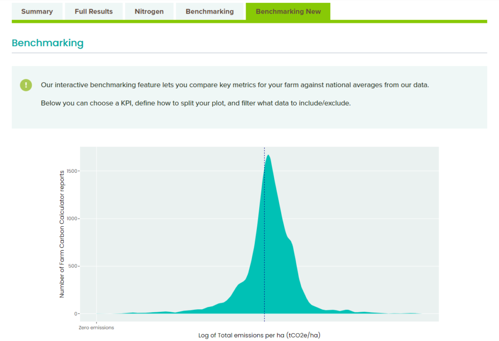
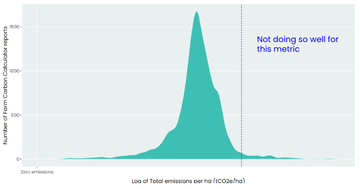
- Total emissions per hectare (tCO2e/ha)
- Total crop yield (tonnes/ha)
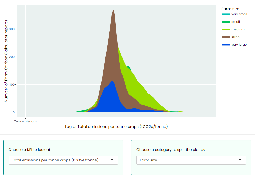
- Total emissions per tonne crops (tCO2e/tonne)
- Total emissions per tonne liveweight sold (tCO2e/tonne)
- Total emissions per tonne FPCM (tCO2E/tonne)
Configuring Your Benchmarking Plot
Once you’ve chosen which KPI to look at from the drop-down menu, you can also choose a category to split the plot by. You can do this by farm type, farm size, region and reporting year.
Filtering The Data
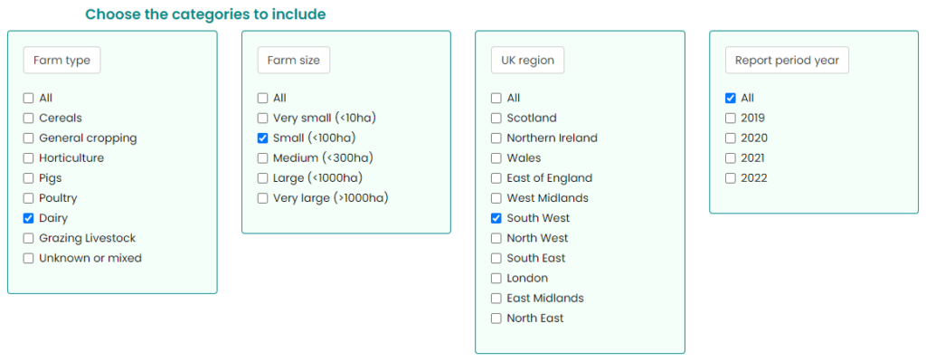
Lastly, you can also filter the category, if you want to include or exclude certain data. By default, all categories are included but you can choose which data to focus on via the check boxes.
For example, if you are a small dairy farm in the South West, you may wish to only check boxes for “Dairy”, “Small (<100ha)”, “South West” in order to compare with similar types of farm.
Interpreting Benchmarking Data
In order to make benchmarking data easier to interpret, we used what’s called a ‘log transformation’ to be able to fit the range of data we hold into a simple graph. It is not easy to read the absolute value for a farm from the axis but it gives you a picture of the spread of the data so that you can see how your farm compares to others.
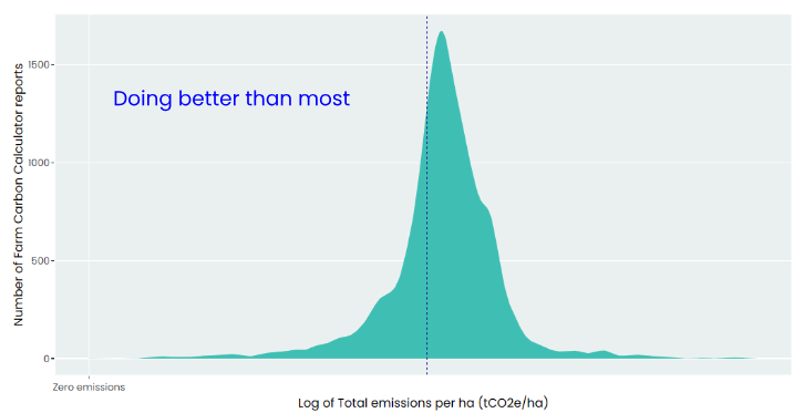
When you have data in your report to be able to calculate one of the key metrics, you will see your report’s value on the chart as a blue dashed line.
Rule of thumb: if your blue dashed line is towards the left hand side of the peak on the chart, you are doing better than most, while if it is to the right hand side of the peak, you may be doing less well for that metric.
What’s Included In Your Benchmarking Data?
The data for the new benchmarking feature comes from our own user-generated reports. This data has been carefully managed so as to exclude – among other things – duplicate values, outliers and test scenarios.
For example, reports for farms that have an area greater than 50,000 hectares, but no emissions or sequestration value, will be excluded from the result set. We will also exclude report names with fewer than 3 characters, or those whose names obviously mark them out as test scenarios.
Once any exclusions have been made, we perform some (minimal) cleansing of the remaining data. We may, for example, infer a ‘region’ value from the farm’s postcode. Or infer a reporting year based on the submission date (where there’s no other information available). Finally, we perform the log transformation explained above, in order to display the information in the most user-friendly way.
While every effort is continually made to validate and verify the underlying data, it’s worth keeping in mind that it will never be completely flawless. Nevertheless, the data is very robust and can help aid in planning and decision-making for your business.
What’s Next?
Our carbon Calculator is regularly updated with new features, emissions factors and general improvements. We will continue this work into 2024, and are excited to see how these changes can enhance carbon reporting for farmers and businesses. We plan to update the farm carbon benchmarking data available annually.